Taxonomy Work and Activity Mapping Gets Beyond the Politics of Science Research
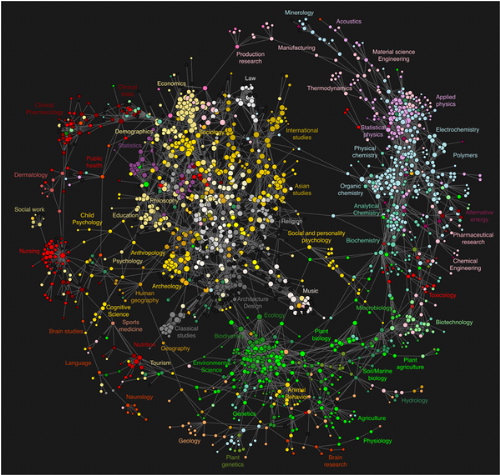
This remarkable image (original here) shows the actual passages of scientists and researchers as they move between articles in scholarly journals. A team at the Los Alamos National laboratory got the idea that mapping scientific research via citation links might be a tad awry because (shock horror) citations have political correctness built into them. So they procured clickstream data covering almost a billion transactions on scholarly journal portals over two years, and produced this elegant map, showing that social sciences and some humanities sit at the densely connected centre of a cartwheel of suspiciously silo-looking scientific disciplines.
The full story is here, including how they mapped two science taxonomies to the Getty AAT in order to show an aggregate map of the relationships between sciences, humanities and the social sciences.
Oh, and the original suspicion about citation mapping? The JCR citation database gives a heavy bias towards natural sciences (92.8%) and a passing nod to social sciences (7.2%). What scholars actually read? Natural sciences 41%, social sciences 47%, humanities 8%, interdisciplinary fields 3%.
Thanks to Jack Vinson for this lead.
0 Comment so far
Commenting is not available in this weblog entry.Comment Guidelines: Basic XHTML is allowed (<strong>, <em>, <a>) Line breaks and paragraphs are automatically generated. URLs are automatically converted into links.